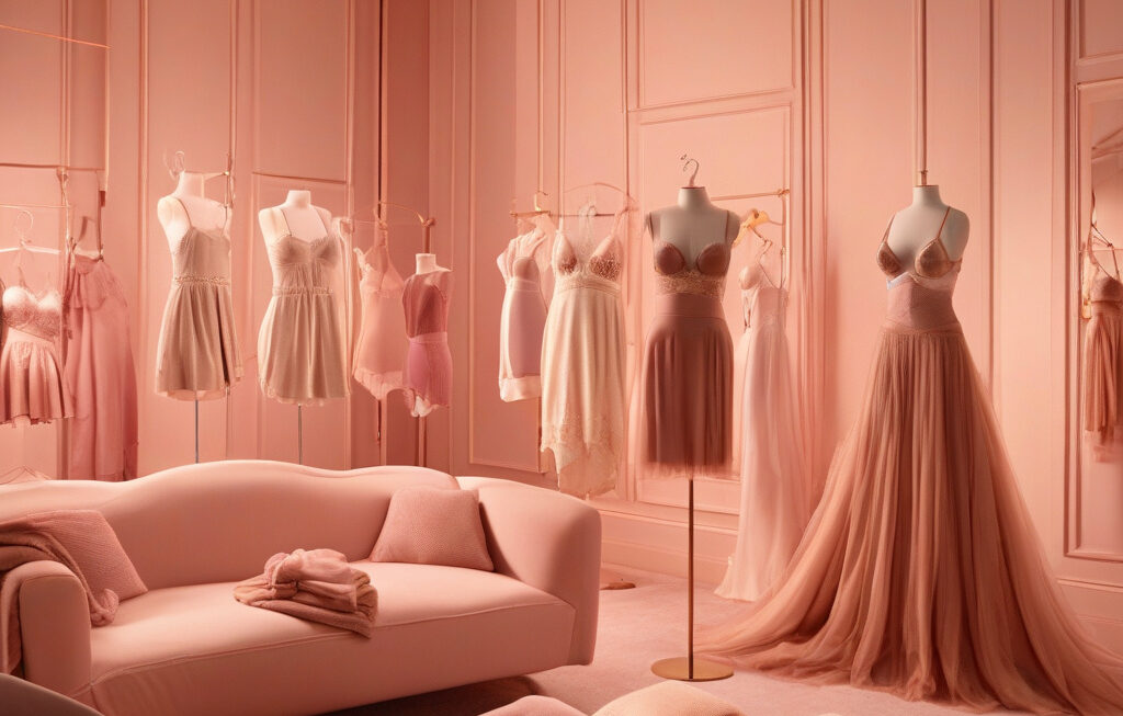


Breaking Away from the Bold: The Future of Beauty Branding
In a world where chunky typefaces in bright colors dominate beauty branding, standing out on retail shelves has become a challenging feat. The bold font boom, once a trend-setting choice for many beauty brands, is now facing saturation as more and more companies adopt similar styles to attract consumers. To remain competitive and capture the attention of customers, beauty brands are now looking towards innovative strategies that go beyond the typical bold typography.
Custom typography has emerged as a key differentiator for beauty brands seeking to carve out a unique identity in a crowded market. By investing in bespoke fonts that reflect their brand ethos, companies can establish a stronger visual presence that resonates with their target audience. Custom typography allows brands to create a cohesive and recognizable look across all touchpoints, from packaging to digital marketing, enhancing brand recall and loyalty.
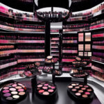
Moreover, the shift towards more varied visuals is reshaping the beauty branding landscape. While bold fonts have been the go-to choice for many brands looking to make a statement, the emphasis is now shifting towards a more holistic visual language that includes a diverse range of design elements. From intricate illustrations to minimalist graphics, beauty brands are exploring new avenues to express their creativity and connect with consumers on a deeper level.
One example of a brand that has successfully embraced custom typography and varied visuals is Glossier. Known for its clean and minimalist aesthetic, Glossier has developed a signature font that is instantly recognizable and synonymous with its brand. By incorporating playful illustrations and pastel hues into its packaging and marketing materials, Glossier has created a cohesive visual identity that sets it apart from traditional beauty brands.
Another brand that has embraced the power of custom typography is Fenty Beauty. Rihanna’s makeup line features a bold and distinctive font that reflects the brand’s edgy and inclusive ethos. By using custom typography across its product range and marketing campaigns, Fenty Beauty has established a strong brand presence that resonates with a diverse audience.
As beauty branding continues to evolve, it is clear that the future lies in innovation and creativity. By moving away from the bold font boom and exploring new avenues such as custom typography and varied visuals, beauty brands can differentiate themselves in a competitive market and capture the hearts of consumers looking for fresh and exciting experiences.
In conclusion, the era of bold fonts in beauty branding is giving way to a more diverse and creative approach that prioritizes custom typography and varied visuals. Brands that embrace this shift towards innovation and uniqueness will have a competitive edge in the ever-changing beauty industry, setting new standards for creativity and brand expression.
beauty branding, custom typography, varied visuals, innovation, creativity